Consider this scenario:
You walk into a supermarket and start adding items to your cart for the week. As you shop, either of the following situation occurs:
- You receive a text message
- You notice there is no one else in the store
- You see a cat walking down the aisle.
As soon as this happens, you stop what you are doing, walk out the store, and forget about your shopping.
Sound bizarre?
Absolutely. Yet something like this happens every day to hundreds of your site visitors. They add products to their carts, then for some reason, leave the site before finishing the purchase.
On average, 7 out of 10 shoppers abandon their shopping carts, causing your business to leak money every day.
How can you plug this leak and get customers to finish their purchase?
In this post, I’ll show you how the world’s best retailers reduce their shopping cart abandonment rate, and how you can do the same.
1. Use email retargeting to target abandoners
According to Listrak, the average shopping cart abandonment rate is as high as 80%.
That is a staggering statistic which can’t be overlooked. If you want to overcome abandonment, you need to engage in email retargeting.
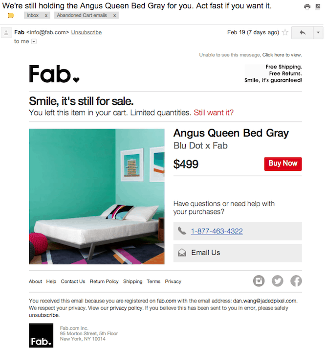
With email retargeting, you send emails to customers who added products to their cart but failed to complete their checkout.
Keep in mind that not every cart abandonment occurs due to a change in the customer’s mind. There are plentiful of other factors at play such as the website crashing, the site timing out, or the customer getting distracted by a phone call and then forgetting about their shopping cart.
For example, here’s how Fab reaches out to abandoning shoppers:
Here’s how Land’s End does the same:
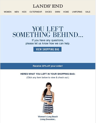
Re-targeted emails are very effective with almost half of them being opened and over a third of clicks on them leading to a purchase back on the original site.
2. Bypass account creation
Marketers commonly mistake the checkout process as a golden opportunity to collect data from their users.
However, from the user’s point of view, this is akin to imposing a relationship they don’t necessarily want to be in.
In fact, being forced to sign-up to complete a purchase is reason enough for 14% to abandon cart.
The solution?
Offer guest checkout. Without requiring an account to complete a purchase, you make the life of the customer easier and let them organically progress towards creating an account with you on their own accord.
Here’s how ASOS found an innovative guest checkout solution:
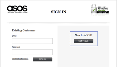
By removing the mandatory registration, ASOS halved their abandonment rate despite there being little difference between this ‘guest’ process and the actual the registration process.
Target does something very similar – it gives customers an option to checkout without signing-in.

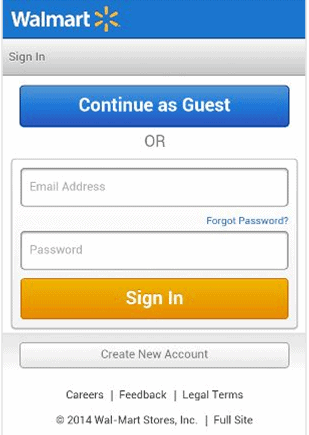
Walmart follows this tactic on its mobile site as well. Before they checkout, customers are given a chance to sign-in, or to simply check out as a guest.
3. Have a wide variety of payment methods
Customers are unpredictable and can abandon their cart over the smallest of details. Something as simple as a lack of their favorite payment method can cause shoppers to quit.
In fact, according to a YouGuv study, among regular shoppers, 50% would abandon their purchase if they didn’t find a favored payment method.
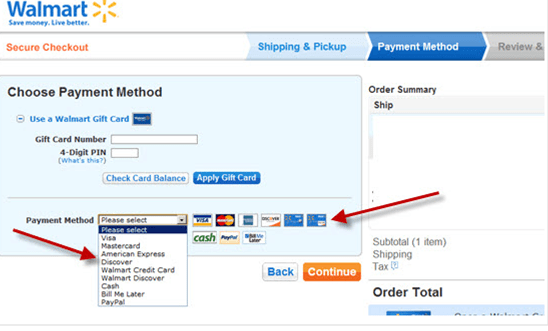
The easy way out of this would be simply to add as many payment methods as possible. You can’t expect customers to open a new credit line just because you don’t accept PayPal or cheque.
Take a look at the variety of payment options Walmart provides:
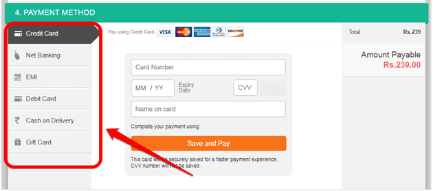
Indian retailer Flipkart does even better by offering customers a total of 6 different payment methods:
4. Keep customers informed with a progress bar
When a customer begins their checkout process, they have no clue how long the process will take them. While most customers are patient enough to bear the first few pages of checkout, the longer your checkout process carries on, the more likely frustration will begin to set in.
This frustration is reason enough for 10% of online customers to abandon their cart.
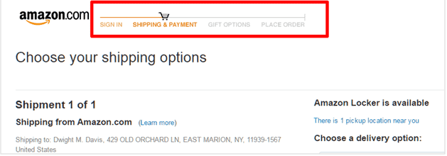
Providing a visual reference to their location in the checkout process will help visitors determine how close to the end they are. In doing so, you prevent doubt from creeping into their mind whether buying from you is the right decision.
Here’ how GoDaddy keeps its customers informed :

Lots of other retailers do this as well, such as Amazon:
5.Offer customers a shorter checkout option
If you can’t avoid making a lengthy checkout, consider adding an express checkout option like Namecheap which allows immediate checkout from the cart.
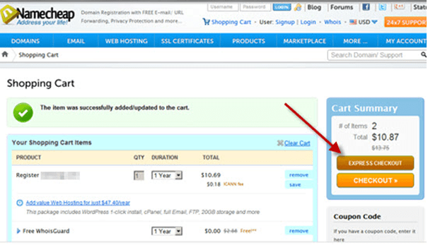
The shorter the process, the better. However, keep in mind not to offset a short process by adding more information fields in each step. Presenting customers with form after form of questions no matter how short will lead to abandonment.
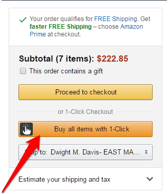
If you have existing customer information (such as address and credit card number) on file, you can consider offering a 1-click checkout option as well, like Amazon:
6. Highlight your free shipping
People are greedy.
They want to cut costs while shopping, not have to wait for delivery or pay for it either.
Unfortunately, shipping charges counters this desire and serves as a hidden cost which causes people to abandon their purchase.
As a result, free shipping has become a necessity rather than a perk. It is so important, that 73% of potential buyers are ready to spend money online only if free shipping was assured.
Therefore, providing this benefit and ensuring everyone knows it by posting the information on your homepage is important.
You can either provide free shipping on every order despite price, size, and quantity or set a minimum purchase rate to avail the free shipping offer.
Here’s how Nordstrom tells its audience.
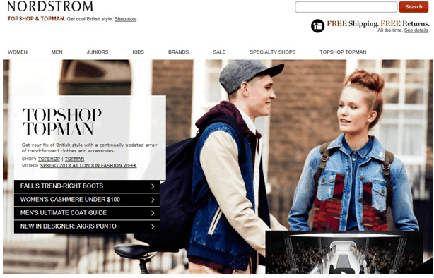
You can’t miss the free shipping banner even if you wanted to.
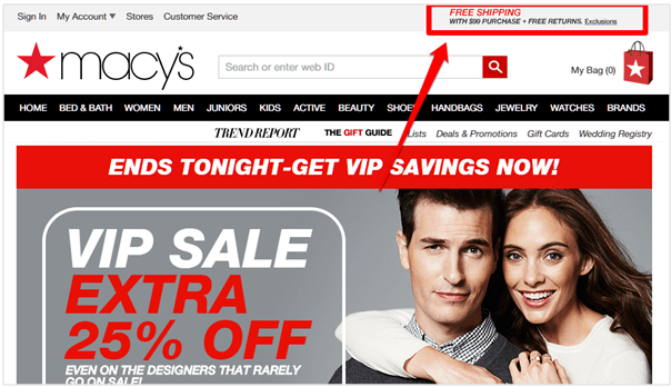
Macys does something very similar. It even tells you how much you need to buy to get free shipping:
7. Use a strong call to action
Just because a customer has added a product to their cart doesn’t mean that she won’t need a push to complete the purchase.
Including action-oriented CTA on your checkout pages will help customers understand where to click, what they will get, and what is expected of them. If such information is not clear, your customers may feel lost and abandon the cart in frustration.
Ensure that the style and tone of your CTA is consistent across all your pages and don’t use ambiguous language such as “continue” which doesn’t prompt the user to take a action.
Here’s WarbyParker with a simple yet highly effective CTA on their checkout page :

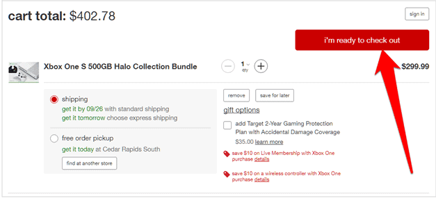
Target makes its checkout more explicit. It also uses affirmative, first-person copy in checkout buttons:
Conclusion
Shopping cart abandonment is a big issue for e-commerce businesses. By implementing the tactics mentioned above, you can get more shoppers to complete your checkout process the first time. If you are still faced with an abandoned cart, you are well-equipped to bring them back and complete their purchase.
Start using these today and watch the change in your store’s sales.
cart abandonment


Leave a Reply